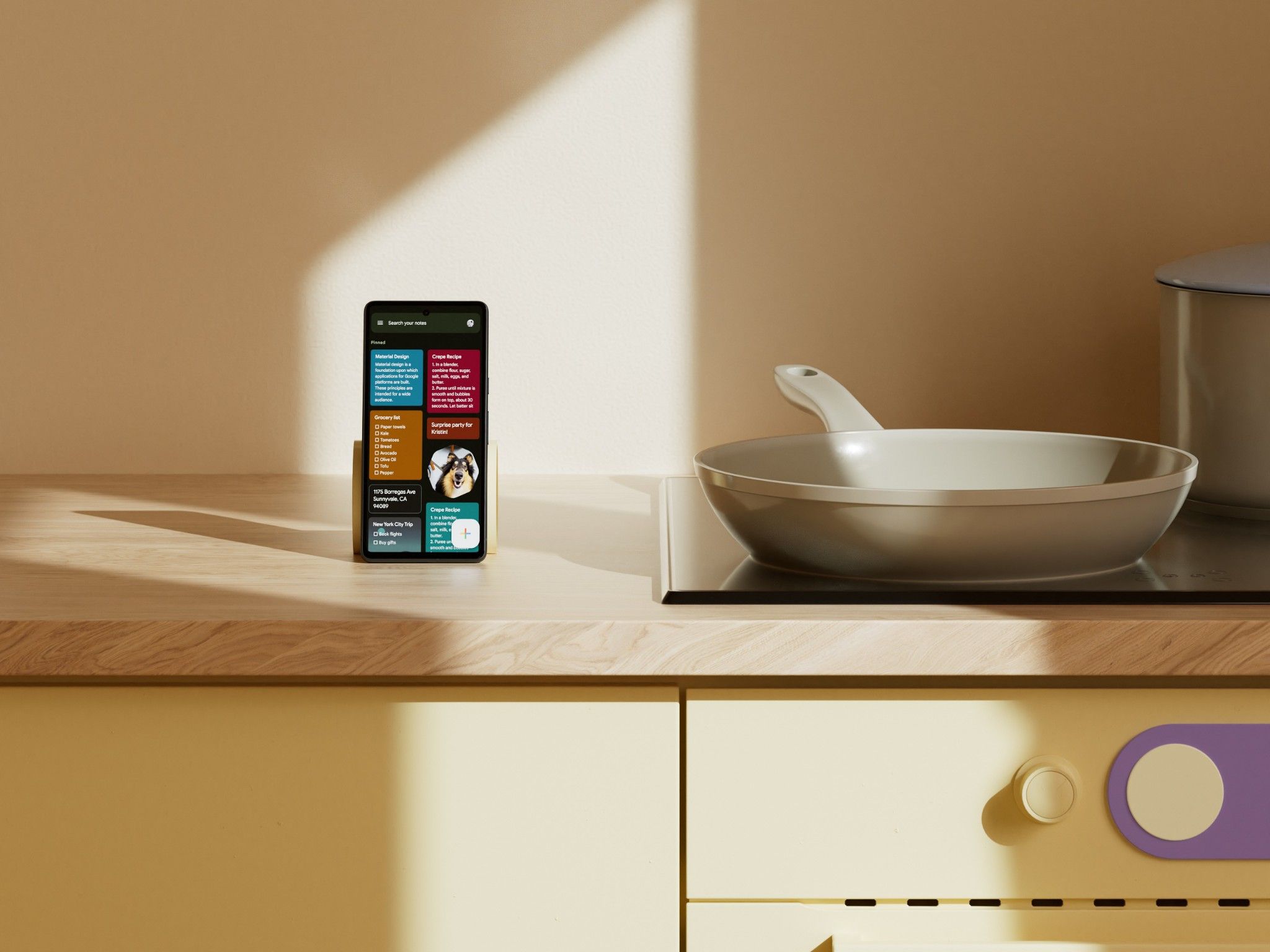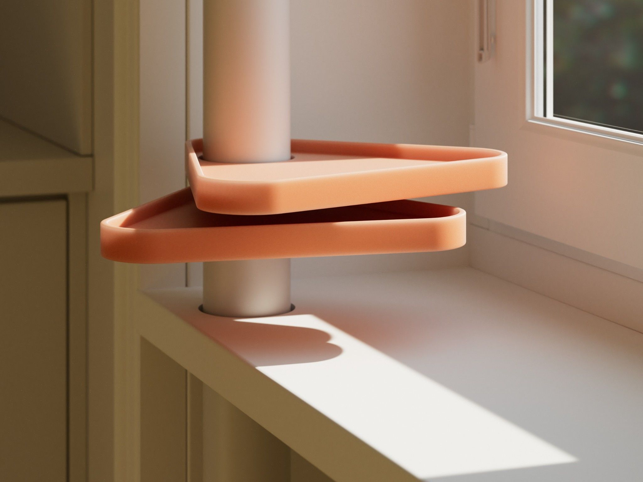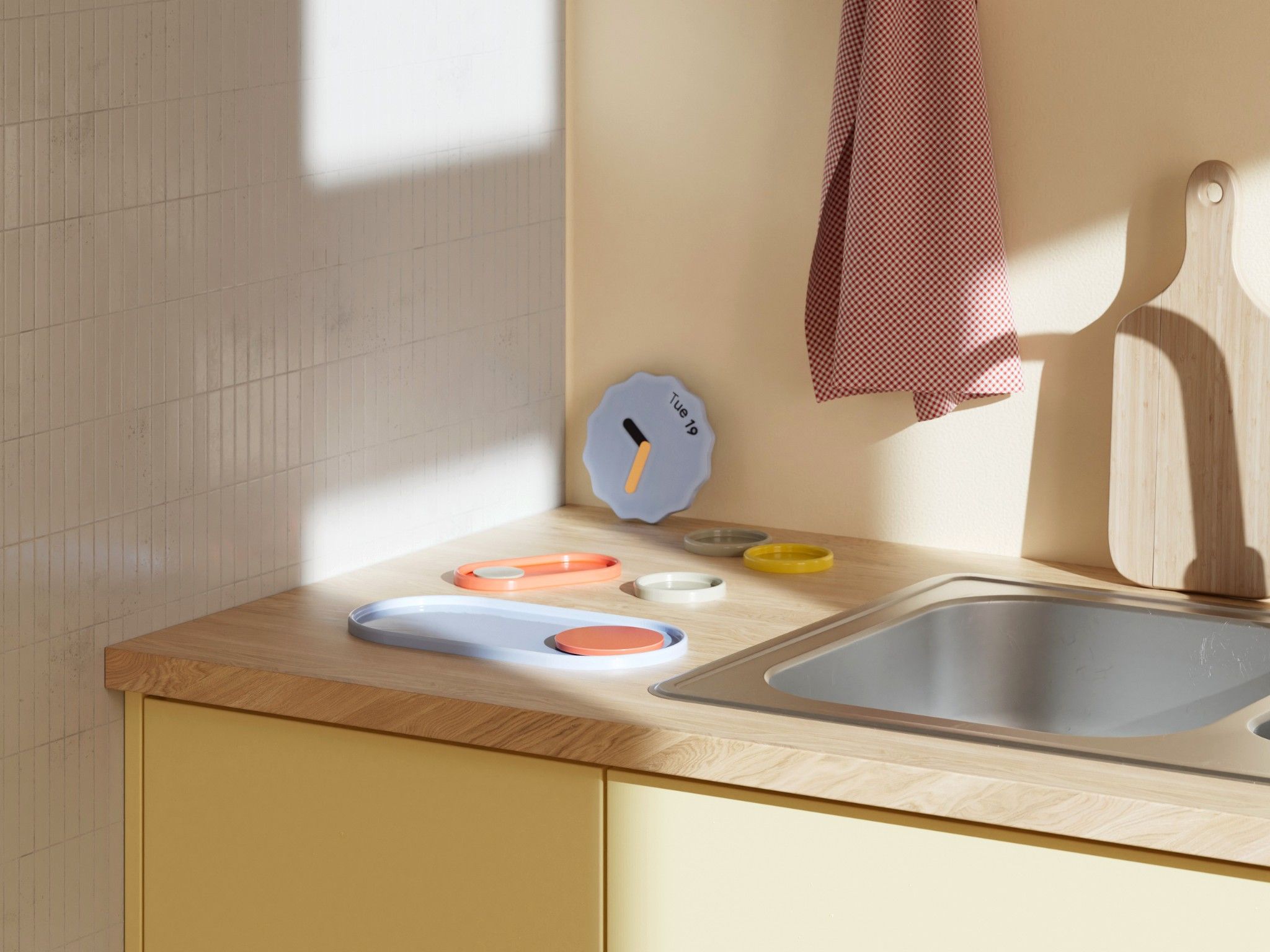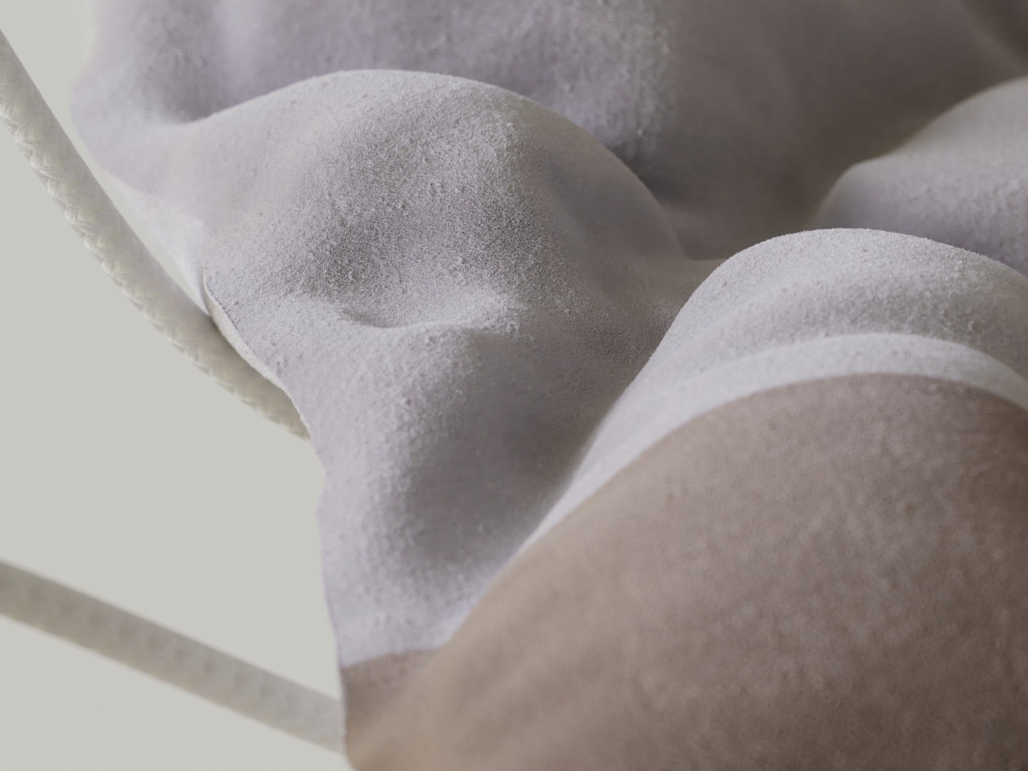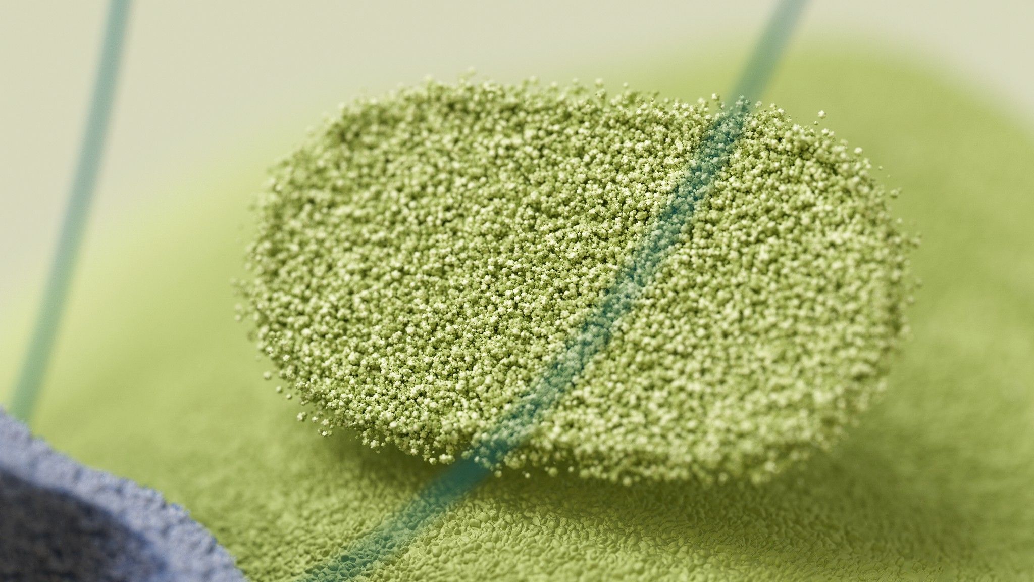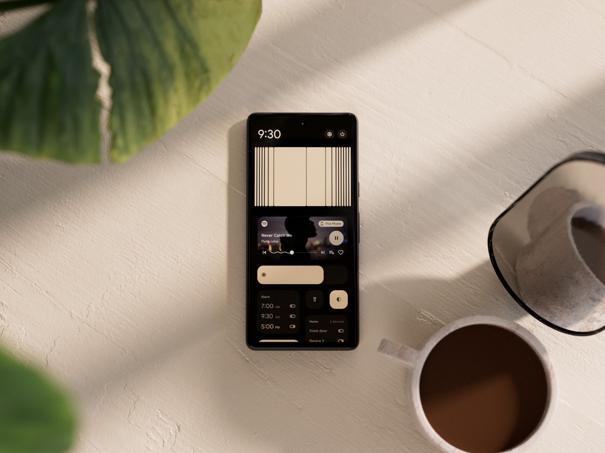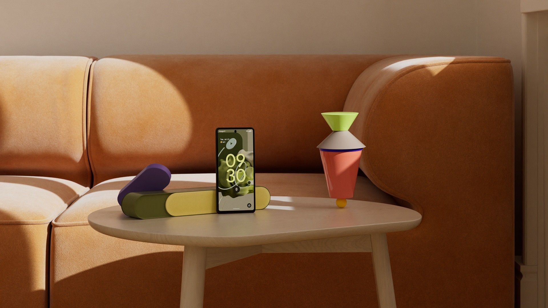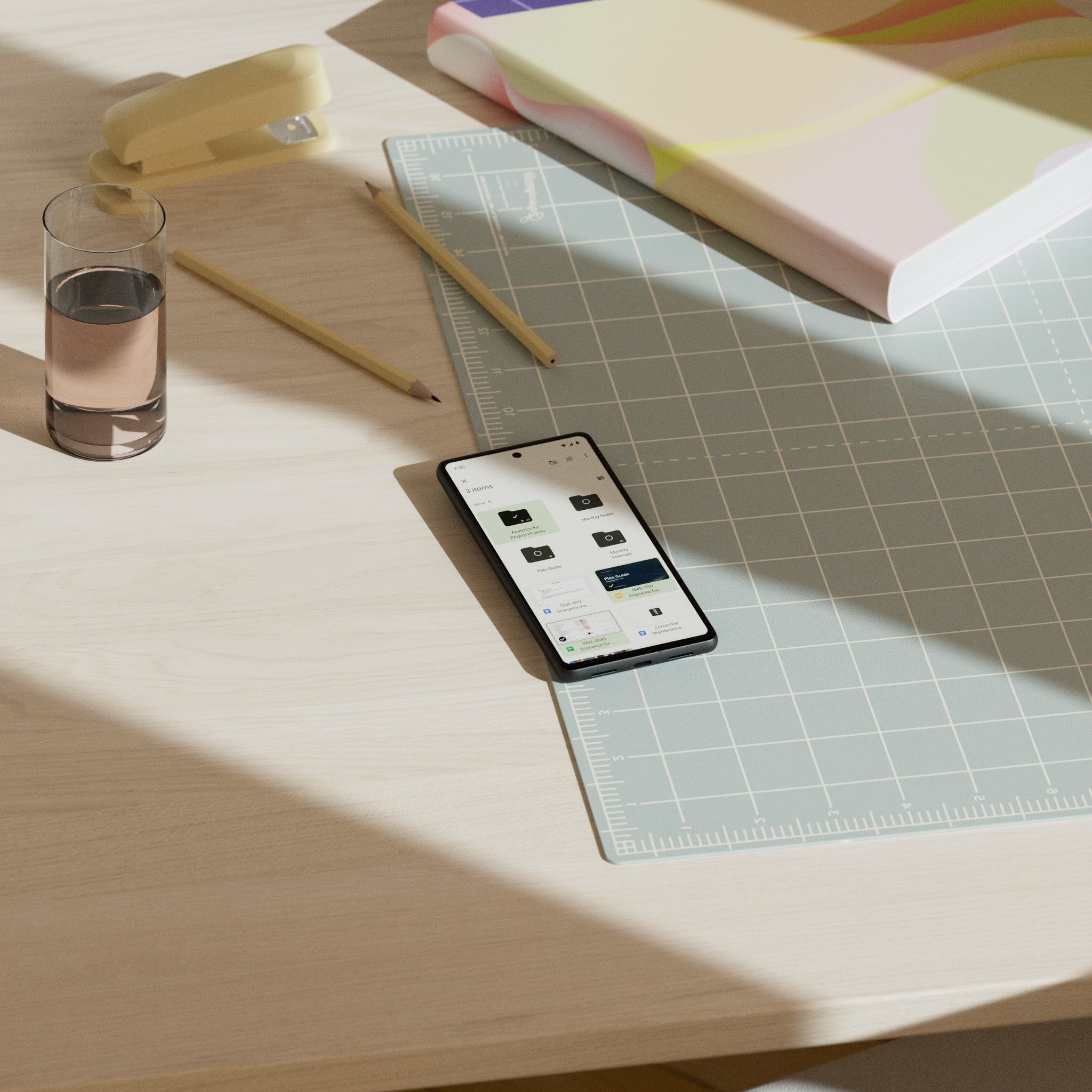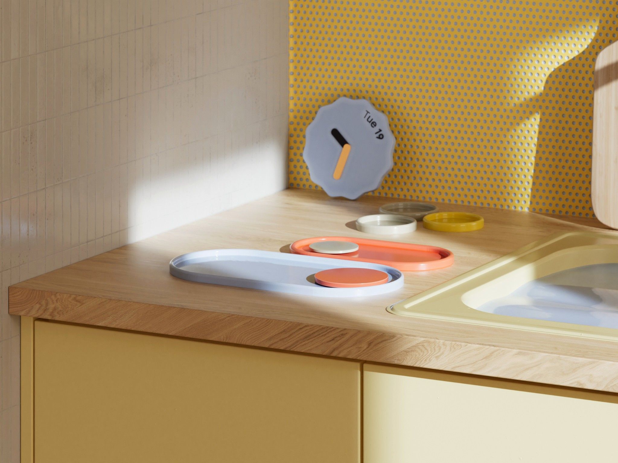

As a part of someform Studio I was working with a great team on all aspects of this project, from styleframing and art direction to simulations and production. Our initial brief evolved around the idea of building a narrative that travels through different levels of detail and touches upon different aspects of the “MaterialYou” user interface design. From the smallest particle, to parts of the UI, to Google’s very own devices in a semi-realistic environment.Aesthetically our research evolved around defining a palette of materials, objects and tactile qualities that would be ownable by Google Design. Not only to distinguish the designs from those of competitors, but also to express an emotional quality that suits the overall brand expression. Some of these qualities included approachability, warmth, friendliness, which in turn resulted in soft materialities, organic forms and playful and engaging shapes.
DESIGN & DIRECTION
someform Studio
CREATIVE TEAM
Helge Kiehl, Matthias Winckelmann, Dominik Grejc, Yannik Wenk
SOUND
Zelig Sound
CLIENT
Google Design
CLIENT CREATIVE DIRECTOR
Nando Costa
someform Studio
CREATIVE TEAM
Helge Kiehl, Matthias Winckelmann, Dominik Grejc, Yannik Wenk
SOUND
Zelig Sound
CLIENT
Google Design
CLIENT CREATIVE DIRECTOR
Nando Costa
